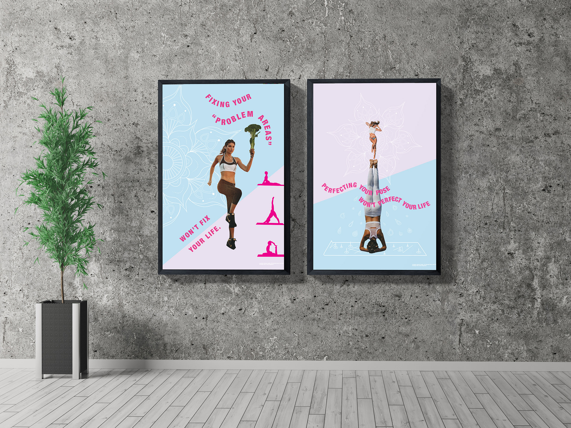
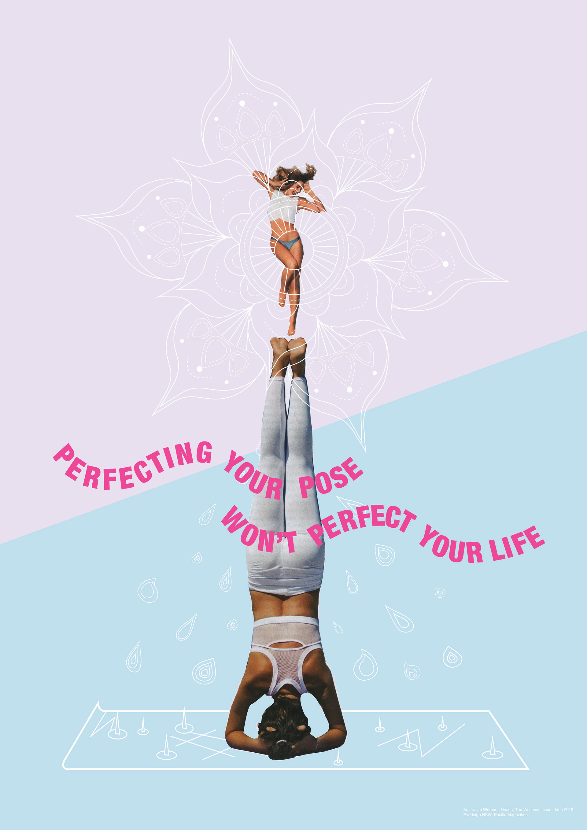
This project was to critique a magazine and the message it was sending the audience. The task required physical cutting out of raster images from a magazine that would be scanned and placed across two posters that were to communicate our critique. The production of two posters was required with these two posters being designed as set reflecting the same message and providing a clear visual relationship with one another.
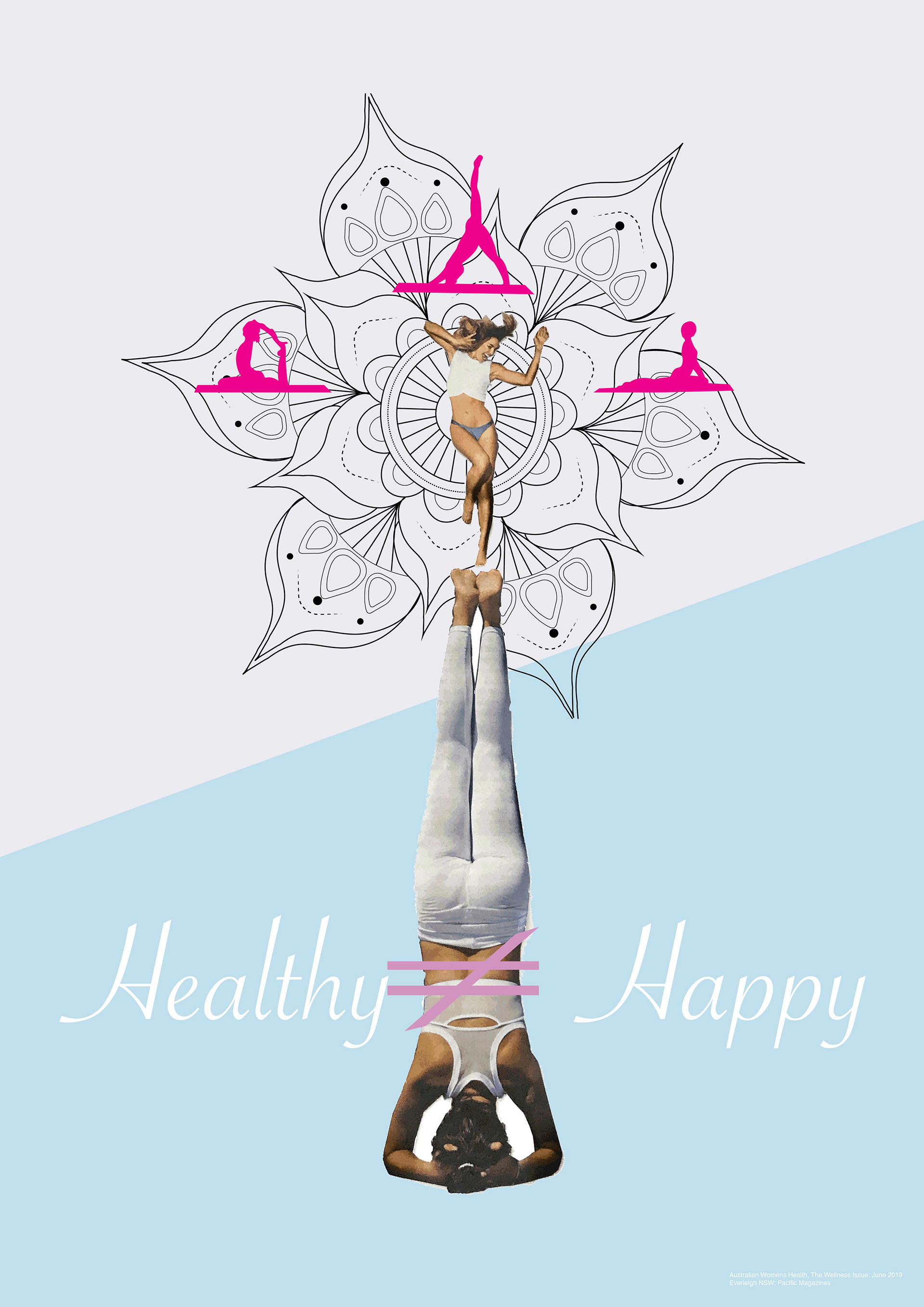
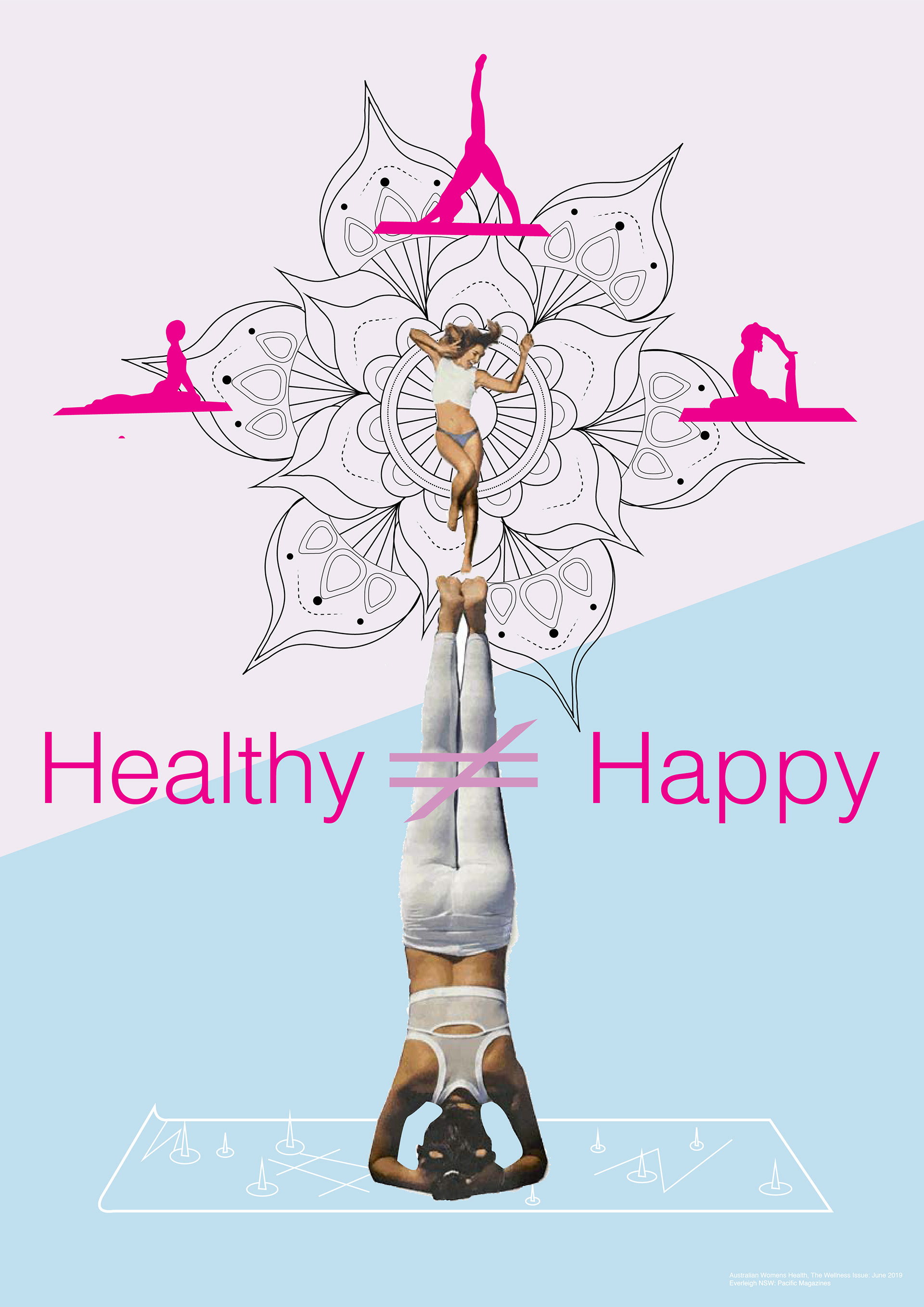
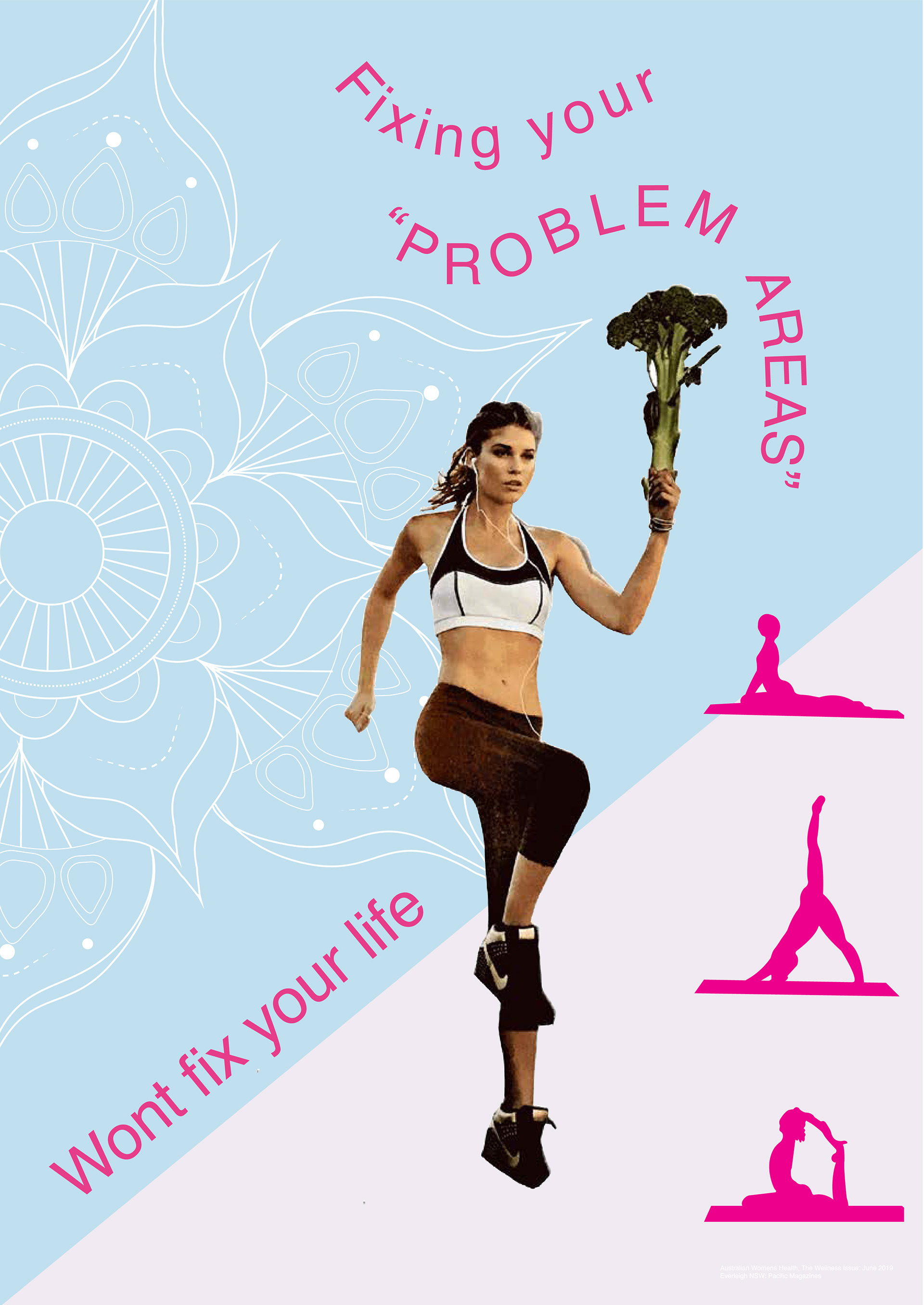
I sourced my raster images from Women's health magazine. (Women's health, June, 2019). The overall theme of the magazine I selected was “Healthy people have perfect lives”.The images in the magazine portray an array of unrealistic happy, smiling women with perfect hair, skin, nails and teeth eating restaurant quality food and enjoying life. The text is littered with “quick and easy, helpful tips” that are designed to inspire (or guilt) the reader into getting their life together simply by getting toned, fit, healthy, and flexible. I wanted to reveal the hidden message that this magazine is selling its audience, a “perfect” life
At first glance, the posters are designed give the viewer a sense of positivity. The light soft colours, mandala, flowing text and healthy perfect women all communicate this to the viewer. It is not until the audience begins to look deeper that the true meaning is revealed, much like the magazine itself. The women are being haunted by the desire to improve their health in order to improve their lives. This is shown by the perfect yoga poses, broccoli torch, the distressed women standing on top of the one practicing yoga, and message in the text. The image has been designed to feel contradictory.
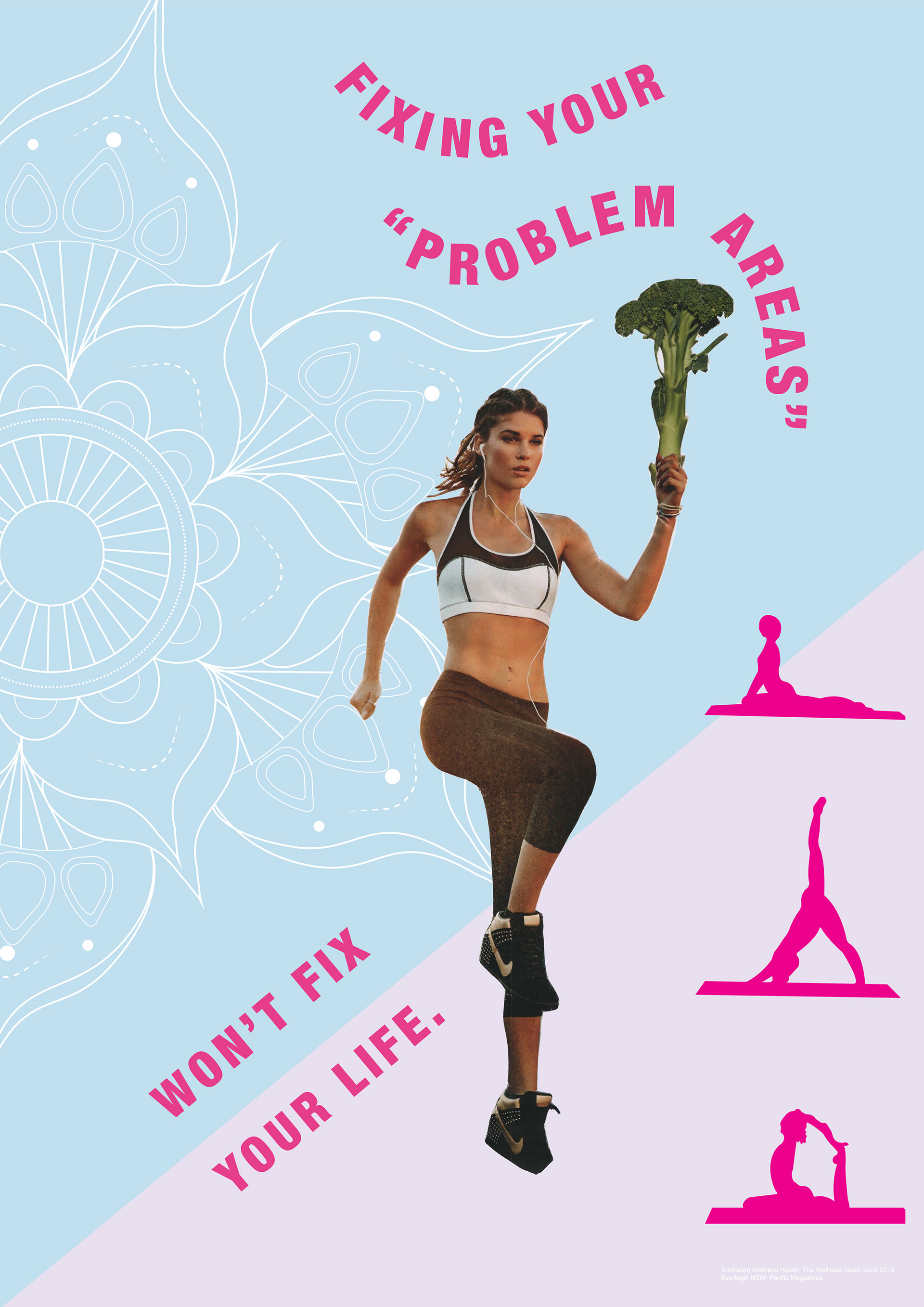
For poster “A” I received mostly positive feed back during critique. I changed the positioning of the text in the bottom right, splitting it in half and placing half above and half below the line. Letter spacing was corrected on the curve.
For poster “B” the mandala was made white and placed over the top female image, the pink figures were removed as they felt overpowering, sweat drops were added around the bottom raster image, as well as changing the text. The text was changed to a clearer message as well as placed on two curves to link to poster “A”